Case Study for Empower Behavioral Health & Intervention
Client was looking to rebrand their company as they expanded their services and approach the market in a new way.
Opportunity
We were approached by an existing client to develop a new logo utilizing a concept provided by them Being familiar with their existing logo and what the company provides gave us a jump-start on ideas, but the client wanted to play with the idea of a human-style logo design and brighter colors, something their existing logo did not include.
Solutions
Graphic Design
Brand Refresh
Approach
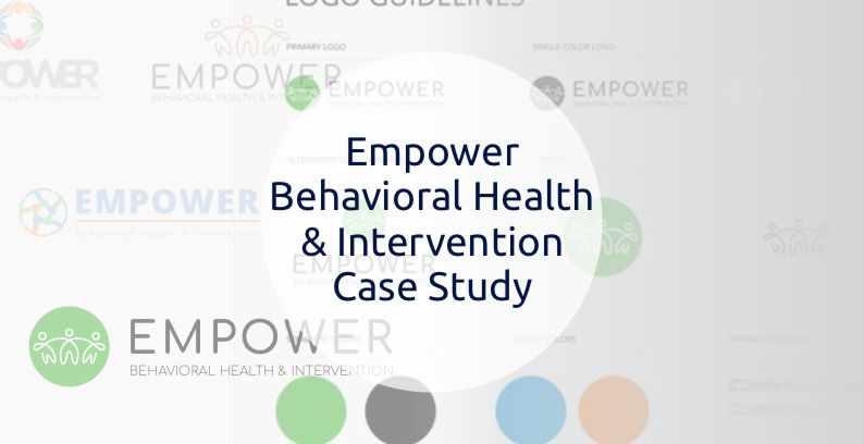
First, we took notes on what our given example consisted of: humans, hands, circle, lime green, orange, and blue. Having some kind of representation of people included was important. Being a redesign, having the brand name would be crucial, until any graphic can be recognized on its own.
References
Impact
Their existing logo was a wordmark (text-only logo), so with the client’s provided icon, we were comfortable going in a different direction. After researching businesses providing similar services and taking into account use in signage and print, we developed multiple pictorial mark logos instead, accompanying them with the entire brandmark. Along with a package of different file formats, Outreach presented the client with a business card and letterhead design. We concluded with creating a Logo Reference Guide, with the logos fonts, colors, and recommended layouts.